There’s a science behind constructing a digital environment that converts, and it goes beyond mere aesthetics. Strategically placed design features can play a major role in guiding users from one step of the inbound methodology to the next. And we’ve found that some of the most effective and engaging design elements are what’s known as “microinteractions.”
So, what exactly is a microinteraction?
A tidy flashcard definition of the term is hard to come by. However, in short, microinteractions are the small touchpoints through which a person interacts with a website or app. Hence the name.
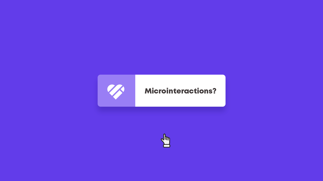
Things such as “like” buttons that explode into confetti when you click on them. Dropdown menus that elegantly unfurl from the top of a landing page, beckoning you deeper into the website. Login fields that vibrate as if agitated when you enter the wrong password. Even something as subtle as an image that moves or changes color in response to your cursor is an example of a microinteraction.
This sort of effortless give-and-take is what makes a website feel alive. Actions trigger reactions. As if the developer is telling you, “The website works! Things are happening! And you’re making them happen!”
The beauty of designing a website or app is the added layer of interactivity that you can’t achieve through more static forms of advertising. Microinteractions allow the user to participate in and contribute to their own experience. So, when a user engages by hovering or exploring with their mouse, it’s best to reward them with a delightful interaction to continue this behavior.
To summarize: In terms of form, microinteractions are user-initiated (often animated) graphics that serve only one purpose. In terms of function, they are helpful visual cues that signal to a user that something is happening.
How we use microinteractions at DI
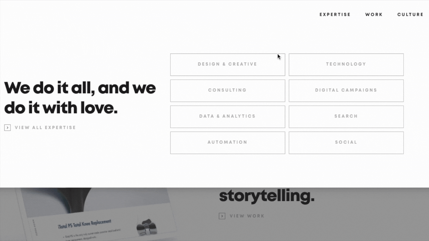
The implementation of smart, interactive design features is an indispensable part of our web development processes at Digital Impulse. For ourselves and our clients. A great example of unique microinteractions that we created to emphasize a client’s identity was the ones we built for Generis Collective.
The experience that we wanted to produce for users of the Generis website was one that was elegant and intuitive but still unique and surprising. Elevated yet unexpected. Accessible and exceptional. The head of our Design team, Travis Pease, does a great job explaining how they used interactive design features to accomplish this.
We laddered all our design decisions up to this overarching visual theme, which we brought to life using features like load-in animations, parallax effects to create depth, scroll hijacking to take the user in an unexpected direction, and background color transitions to highlight key elements. The result: a unique, exploration-worthy digital experience as intriguing as any of Generis Collective’s physical spaces.

As you can see, the execution and implementation vary case-by-case. Some clients require a whole new bag of tricks while others simply require us to play the hits. That said, our underlying philosophy and reason for using interactive design features remain constant, and it’s all based on the following four principles.
Bring your website alive
From a UX perspective, microinteractions make a webpage more hands-on and reciprocal. They increase user activity by giving users more things to, you know, activate.
It may be computer science, but it certainly isn’t rocket science. More opportunities to engage lead to more engagement. Simple as that. When designing a website, the goal should be to create an environment where people feel as though they’re really using the website rather than just looking at it. The fact that they did something to make a certain feature move or change keeps them stimulated and, most importantly, on the page.
Convey information
Animations can be useful in communicating the status of a system, whether it’s a graphic to indicate buffering, to confirm that a form has been submitted, or that a password is correct. Providing visitors with this sort of timely feedback makes your website or app easier to understand and navigate.
In addition to helping them in the moment, the hope is that this visual feedback will make them more knowledgeable and intuitive users of your website over time. Showing a person how their actions produce certain reactions makes them more aware of what they’re doing. Like how spellcheck in word processors makes people more conscious of spelling or speedometer signs on the side of the highway encourage drivers to slow down.
As Nobel laureate economist Daniel Kahneman said, “Intuitive expertise is learned from prolonged experience and good feedback.” For marketers, microinteractions are a way to provide a good experience and good feedback.
The most important goal of these features is to provide the user with a sort of visual commentary on how they’re interacting with a site. Making microinteractions delightful and visually pleasing is the cherry on top of the sundae.
For developers and designers, using visual cues to deliver a message is in keeping with Jakob Nielsen’s “Usability Heuristics,” a set of web design principles set forth in the 1990s to guide developers in creating optimal user experiences. One of these heuristics is called “the visibility of system status” and states that a website should use graphics to keep users informed about what’s happening.
Influence user behavior
It’s no secret that businesses use design to influence consumer behavior. The order of items on a dinner menu, for example, isn’t arranged by accident. The layout of a department store isn’t chosen at random. In the digital realm, a web page’s content is purposefully designed to nudge visitors towards a conversion. Interactive content especially makes the whole experience more participatory and therefore enjoyable.
Scientifically speaking, microinteractions have the power to elicit a dopamine response in a user’s brain that motivates them to keep interacting with a website or app. In a fascinating blog piece about UX and psychology, Andrés Zapata wrote, “The motivation to click on something or fill out a form is a vastly different thing than the motivation to find water, food, or procreate. But through the lens of chemistry, especially neurotransmitters, motivation is motivation.”
Designing interactions that trigger this brain chemistry is the key to building a website that converts. Once they are designed, advancements in optimization testing allow us to play around with content placement and composition to find the most effective arrangement.
As we touched on in our blog about choice architecture and conversion rate optimization, there is no such thing as a neutral design. Details are never just details. Every aspect of your website has the power to produce (or contribute to) certain patterns of behavior. And strategically placed microinteractions are one way to leverage motivation and retain a user’s attention where it matters most.
Add some style to your website
Yes, design influences behavior. But that doesn’t mean that microinteractions are limited to strictly practical uses. Design is the art of making things possible, sure, but it’s also the art of making things beautiful.
Microinteractions are an opportunity for a brand to inject their unique personality into their digital presence. Beyond establishing a brand voice through the copy written on a website, a brand personality can be communicated through movement and animations.
Our own website is full of user-initiated animations that partly serve a practical purpose but are mainly just there to add visually stimulating flair to the page.
Here’s a quick tour of some of the microinteractions on our current website.
Before you go
These details may be small, but the sum of these small details constitutes the bigger picture, the user experience.
It’s like when you meet a person and find them likable. Why did you like them? Maybe it was a sparkle in their eye, a reassuring smile, a comradely pat on the shoulder. If minor details like these can influence your impression of a human being, then surely, they can influence your experience of a website, something markedly less complicated.
If you feel inspired to create a more interactive website, our team would love to chat. Contact us today to start designing a digital space that converts.