An unmistakable visual identity. That is the holy grail of design in marketing.
The realization of a graphic style that so perfectly encapsulates your business’s personality that when consumers see it, they intuitively associate it with your brand.
Think about organizations like The New Yorker, Spotify, or even the National Park Service. You hardly need to see a logo or even a word printed on their products or imposed on their marketing materials to know whose it is.
Their appearance is synonymous with their brand.
HubSpot does a solid job with this, even on social media posts where their brand name doesn’t even appear on the imagery they’re posting. Here’s an example:
View this post on Instagram
Achieving this level of inbuilt and unthinking brand recognition is no mean feat. But the best marketing designers strive to cultivate a language of colors, pictures, themes, fonts, and symbols that recognizably (and consistently) convey an identity.
When we talk about design cohesion, it means so many different things. If you’re a lifestyle company, for example, and you use a certain model in a lot of your images across channels, that can be super effective. That person becomes branded. Or, if you take photos of your product, making sure it’s always positioned in the same way or shot from a similar angle with similar lighting. This uniformity goes a long way toward establishing a recognizable identity.

Any design department worth their Adobe subscription can whip up an “original” style, but to cement that image in the public consciousness, the key is ironclad consistency and cohesion across channels and media.
If you’re looking to do exactly this, here are some tips on building stylistic uniformity in all of your marketing content.
Step 1: Establish brand stewardship
The members of your team will inevitably have unique opinions regarding the stylistic direction of your brand. You’d never want to discourage these many and varied ideas or quell enthusiasm, but if your goal is to maintain a unified vision, your team’s creative energies may require some corralling.
Naturally, this will mean designating a handful of internal corrallers (not to be confused with corallers, a person who dives for coral) to perform quality control.
This is not another arbitrary who’s going to own this delegation. Brand stewardship is a solemn responsibility. Whoever this person ends up being will hold the keys to a piece of your public image – even your legacy.
As such, they should be tenured and know the company’s story front to back. They should be well-versed in your firm’s differentiating factors, visual guidelines, culture, and identity. They should know who you are, who you hope to be, who you are to the public, and who you are in private.
Brand stewards aren’t gatekeepers, but they are astute referees whose job is to evaluate creative assets and call fouls where they see them.
Step 2: Create agile and repeatable design processes for different platforms
Odds are you either have a strong visual identity or are on your way to building one. But that’s just a starting point, the spring from which divergent streams flow out to various places.
The more content you publish and the more platforms you develop a presence on, the more you’ll notice that there is a fine line between consistency and monotony. This margin is one that you’ll skirt up against routinely while designing assets for social posts, display ads, emails, blog posts, you name it.
Creating connectivity while avoiding redundancy
You want all of your graphics to be similar but not the same. Naturally, the main obstacle standing in the way of this goal is that your underlying message is largely the same across platforms. Still, you have to come up with separate and unique ways of conveying that message based on where it’s being published.
If there’s any part of the process where laziness or fatigue can derail your content production framework, it’s here. You’re staring at next month’s social media calendar and thinking who cares if we post the same exact picture on Instagram and Twitter?
The answer is your audience does. Particularly those who follow you on multiple platforms.
They may forgive a certain level of similarity between posts, but too much just comes off as mechanical and impersonal.
The one surefire way to avoid making your audience feel as if you’re simply loading the same images into a content catapult and launching it onto all of their newsfeeds is to create platform-specific design processes.
In other words, this is our recipe for designing website heroes, this is our template for YouTube thumbnails, this is our approach to editing TikTok posts, etc.
Think of it like setting up separate assembly lines for separate products. One conveyor belt in your content factory runs towards Instagram, another towards Twitter. The whole operation lives under one roof, but the deliverables vary based on where they’re being delivered.
Researching well-designed brands’ content quickly shows that their posts look slightly different based on where followers encounter it. This is no accident. It’s the result of purposeful systems put in place to make sure that audiences don’t become fatigued by duplicate posts.
You keep cohesion by defining a rule. That’s why brand guidelines are so important. But, if you get too specific with a given rule, that’s when you get repetition. If you back a rule up and allow for some flexible creativity, you’ll have consistency, but it won’t be so restricting.
Companies that strike this balance between flexibility and adherence to the rules set themselves up for sustainable creative success. They recognize that if people start seeing the same exact images on all of their marketing materials, those people will question the value of following them in more than one place. But, if they stray too far from what people expect from them, their brand recognition suffers.
Here’s a great example of Dunkin utilizing different designs for different platforms to promote the same clothing line. They switch things up enough to be refreshing but not so much that they lose cohesion.
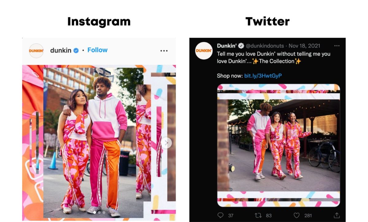
These designs share a common visual language, but you can tell that they were intentionally tailored to fit the platform on which they were posted.
It all comes down to respecting your followers’ time and appealing to their sensibilities. Every channel’s audience – be it Twitter, Medium, LinkedIn, etc. – has at least a slightly different set of expectations and desires. So, the tone and style of your content posted in those places should be tailored to stand out to that crowd.
This requires deliberately strategizing how you will use your visual language to speak to those distinct groups of people. How will your branding be packaged up for a Facebook post? How will it stand out in a YouTube thumbnail?
It may seem like an oxymoron trying to make designs that are reliably similar and refreshingly different. However, maintaining cohesion while avoiding redundancy is key to formulating a style that consumers recognize but don’t grow tired of.
Step 3: Think about how to implement your designs on different media
Tailoring content for a given platform (e.g., TikTok) is all about what the audience wants, tailoring content for a given media type or channel (e.g., email) is all about what you want your audience to do. The objectives are more clear-cut.
Maybe you’re trying to get your audience to download an eBook, fill out a survey, contact your team, or take advantage of an end-of-year sale. Creating designs that nudge people towards these outcomes and fit the media type that they’re designed for begins with a three-step process.
- Goals: What behavior do we want this design to inspire? What action should it point towards?
- Utility: What do we want users to get out of this design? Should it be visually stunning? Entertaining? Is it supposed to be mostly informative and educational? Should we lean on our unique branding to reaffirm their decision to support us?
- Empathy: Put yourself in your buyer persona’s shoes and consider what sort of design would stand out to them. What about your brand design resonates with your target audience?
The answers to these questions will help you tailor unique but still cohesive visuals for emails, landing pages, programmatic ads, print ads, social ads, even blog posts like this one.
Step 4: It’s all connected
In our blogs about micro interactions and web navigation, we discussed the importance of ensuring that all of your designs work together. They may have been created for different purposes, but they don’t exist in a vacuum. They’re all a part of the same system.
When someone clicks on an email CTA and is then brought to a landing page, the transition – visually speaking – should feel smooth and natural. If the contrast between the two designs is jarring or abrupt, then it’s time to rethink one or both of them.
The same could be said of an Instagram story that links to a blog, a display ad that leads to a product page, or even a video embedded within a page on your site. You may have designed these things separately, but they’re a part of the same system. And when things start to become too complicated, the answer might be to simplify your style, so the rules are easier to follow.
Two of the most beneficial things a designer can ask themselves is, first, what does the user actually want? And second, how can we make this simpler? Oftentimes, people don’t want to see something overly complicated. So, if something’s not working, start by taking things away.
Again, none of your designs have to match or be homogeneous, but they should work harmoniously together. There should be unmistakable threads that connect them and make the whole experience feel seamless and inherently yours.
Step 5: Visual Brand Unity Starts with Consistent, Cohesive Web Design
Marketing experts often invoke the “spokes on a wheel” visual metaphor when talking about content creation. Individual blog posts, for instance, should be written around a central topic and linked to a common pillar page. The same goes for series of videos or podcast episodes. The more interconnected everything feels, the better.
When it comes to something as broad and far-reaching as brand design, your website is that central pillar that informs creative decisions across channels. Your site is the sun, and everything else is just orbiting around it.
It all starts with your website and then rolls out to social. On your site, pay attention to the way you crop images, which side you place text, and the orientation of your logo. These stylistic choices should carry over to social posts.
Of course, we realize that we are a web design agency, so us saying that websites are important is a lot like a cordwainer saying that new leather shoes are important. However, having a strong stylistic common denominator to look back at and pull inspiration and guidance from is undeniably helpful. When you’re tasked with creating content for a platform like Pinterest, for example, you can reference your well-designed website and use that to inform any aesthetic choices that you make.
For example, if you notice that, on your website, you always use one font family, then you should use the same on your social posts. Or if you always photograph your products from the left side on your website, then, you guessed it, you should do the same everywhere else.
Ready to start designing? Good, so are we.
No matter what you do or what industry you’re in when you close your eyes and think about your business, specific images, feelings, and personality traits should come to mind.
The goal of cohesive marketing design is to make your audience, most of whom are strangers, see those same images and feel those same feelings. And you achieve this using a language of symbols and graphics.
It’s a difficult task. You’re attempting to give life and character to something that isn’t human. But, with the right people and processes in place, you may be able to create something that sticks in people’s memories, stimulates their imagination, makes an emotional connection, and earns their support.
Be consistent but not repetitive, give each design a purpose, designate watchful creative leaders, and remember that these things don’t happen overnight. Sometimes it takes years for a recognizable style to really come into its own and start flourishing. In the meantime, the key is persistence and authenticity. A strong brand identity can be manufactured, but it can’t be faked.
If you and your team would like to learn more about marketing design or just need help turning your ideas into professional-grade graphics, our design team would be more than happy to help. Reach out today to start building something great.